Changelog

Thumbnail image for changelog item

Pre-built, customizable onboarding and education components

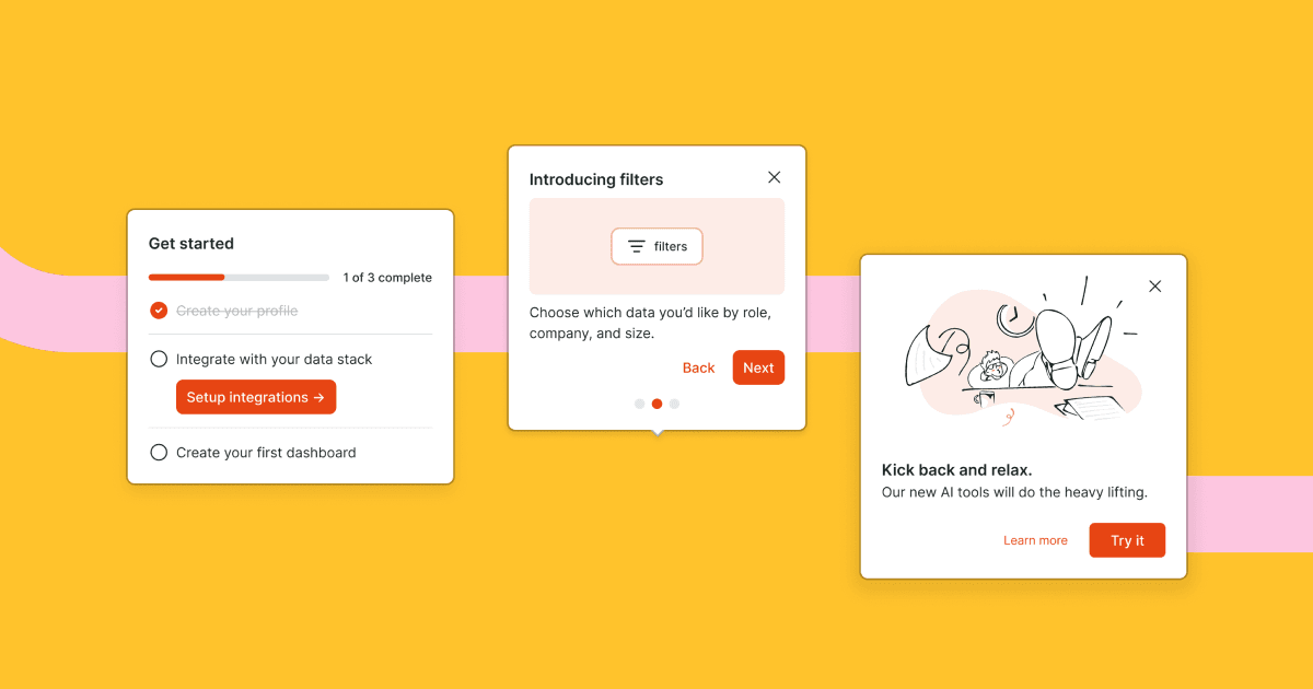
We're excited to introduce pre-built, configurable React components that help you start building onboarding and education experiences quickly and come with best practices built in.

Today we're launching checklist, tour, and modal components.

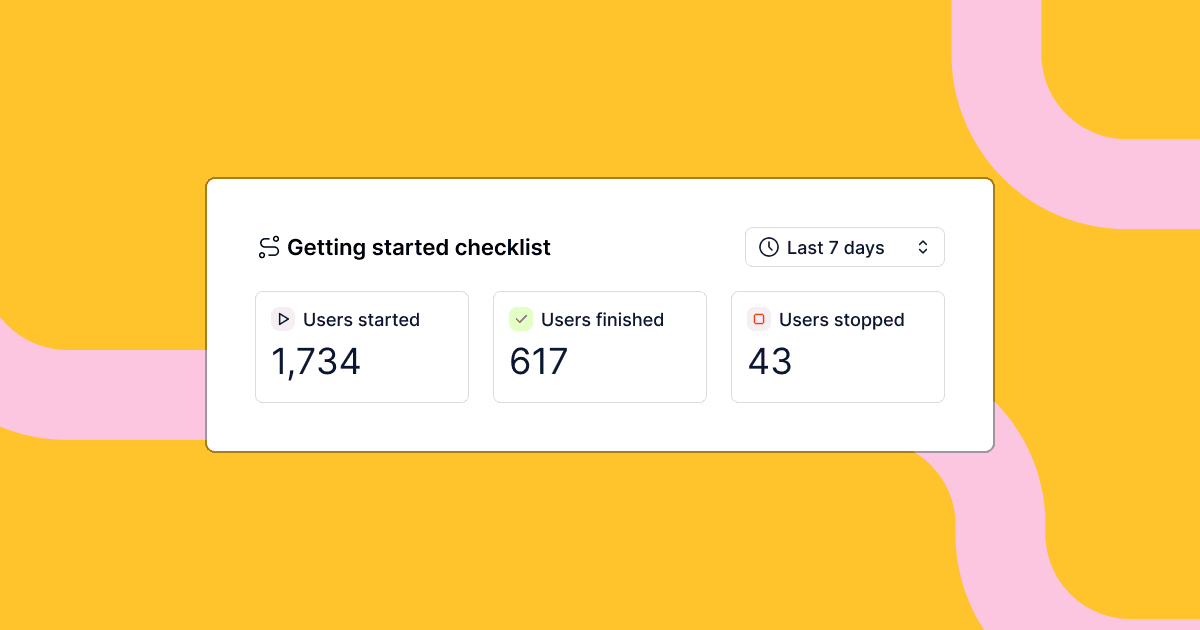
  • The checklist component is a great way to get your users up and running in your product with an action oriented set of tasks.
  • The tour component is a great way to guide your user through new, undiscovered, or updated product features. Positioning and progression logic is built in.
  • The modal component is great for focusing a user's attention on important information in a dialog interface separate from the rest of the content on the page.

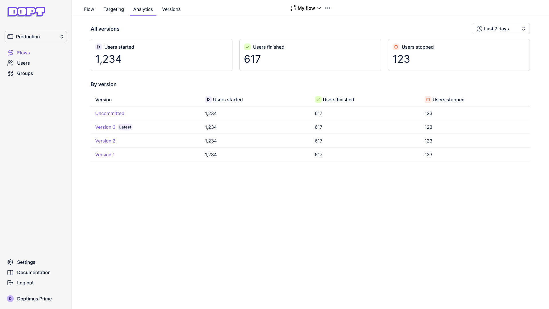
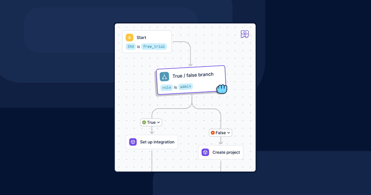
The components are represented as new blocks in the flow canvas. The blocks give you the ability to define content like copy, images, videos, and configuration, like whether or not a checklist must be completed in order.

In code, you import the component and access the content and state of the block with a hook.

Here's an example modal:

import Modal, { useModal } from '@dopt/react-modal';
function MyModal() {  const modal = useModal('my-flow.four-pandas-jam');
  return (    <Modal.Root active={modal.active}>      <Modal.Overlay />      <Modal.Content>        <Modal.Header>          <Modal.Title>{modal.title}</Modal.Title>          <Modal.DismissIcon onClick={modal.dismiss} />        </Modal.Header>        <Modal.Body>{modal.body}</Modal.Body>        <Modal.Footer>          <Modal.DismissButton onClick={modal.dismiss}>            {modal.dismissLabel}          </Modal.DismissButton>          <Modal.CompleteButton onClick={modal.complete}>            {modal.completeLabel}          </Modal.CompleteButton>        </Modal.Footer>      </Modal.Content>    </Modal.Root>  );}

Our components are fully composable and give you easy access to all children for customization, such as adding your own event handlers, composing with your own components, or removing children you don't need.

Styling and theming Dopt components is flexible and easy. Dopt components ship with default theme tokens that can be fully customized or extended. You also can style with vanilla CSS, custom themes, and remove default styles.

You can use the components out of the box as a pre-built component or break out and use it headlessly with your own UI component.

We'll be releasing more components in the near future, like cards and banners.

We hope our new components help you get started quickly while still giving you the flexibility to build best of breed product onboarding and education!

You can read more about components at our website and our docs.


Thumbnail image for changelog item

Segment and Heap integrations

We’re excited to announce new integrations to send events from Dopt to Segment and Heap.

These integrations enable you to do deeper analysis on Dopt flows in your tool of choice without having to instrument any events in the client. For example, you could create an end to end funnel of your Dopt flows in combination with your other product usage data.

Once set up, these integrations will send three events downstream:

  • flow_state_change - e.g. user X finished “Getting started checklist” flow.
  • block_state_change - e.g. user X finished “Welcome tour step 4” block.
  • path_transition - e.g. user X took collaboration path from “Use case quiz” block.

This release lays the foundation for all downstream integrations, so we’ll be releasing integrations with Amplitude and Mixpanel soon!

Check out the docs for more details.


Thumbnail image for changelog item

Measure flow performance with analytics

We’re excited to launch flow analytics directly in Dopt. With analytics, Dopt now has a set of built-in metrics that help you track, understand, and optimize the performance of your flows. These flow insights can help you understand user engagement, learn which flows are working, and pinpoint flows that may need improvement.

Flow analytics page

With flow analytics, you gain visibility into how many users have started, finished, or stopped a flow. You can see these metrics aggregated across all flow versions and individually for each flow version, enabling you to compare the performance of changes across flow versions. You can also choose a time frame to view your metrics, such as the last 7 days.

These analytics work out of the box and don’t require any custom setup or integrations.

Because Dopt experiences are developed in code, your current instrumentation approaches for CDPs and analytics work along side our out of the box analytics. We’ll also be releasing first party, server side integrations with product analytics and CDPs in a few weeks, so stay tuned!

Other improvements & fixes

  • You can now edit webhook and true / false block properties for committed versions
  • In the React SDK, we do a better job of closing socket connections that aren’t used, resulting in less network traffic in your app
  • Improved the latency and throughput of the blocks API to handle requests from SDKs much more quickly
  • Many usability updates to the canvas that make it easier to create flows
  • Fixed a bug when trying to create a flow with a duplicate ID. We also now give an error message.
  • Fixed a bug so the version dropdown now updates after you commit
  • Fixed a bug so saving true / false blocks will now work as expected

Thumbnail image for changelog item

Flow logic and branching

Today we’re super excited to release a set of new features and SDK functionality that enable you to easily build flows with custom branching and logic:

  • True / false branch blocks enable branching based on user properties like role and company properties like plan or the number of employees.
  • Named paths enable you to transition users down specific paths. You can transition users down paths based on things like user actions (clicked “next” or “skip” button), user-collected data (like a question during sign-up), system states (e.g. success, complete, failed), or anything else.
  • Back paths enable you to define paths that go back in a flow.
  • Gate blocks enable you to pause flow progression until all incoming paths have been transitioned, which is useful for creating experiences like waiting until all checklist items are complete before progressing to the next step.
  • Updated SDKs and APIs give you access to the block states and flow transitions to make building your user flows even easier. Our SDKs are headless and power your UI components.

You can read more about these features on our blog and our docs.