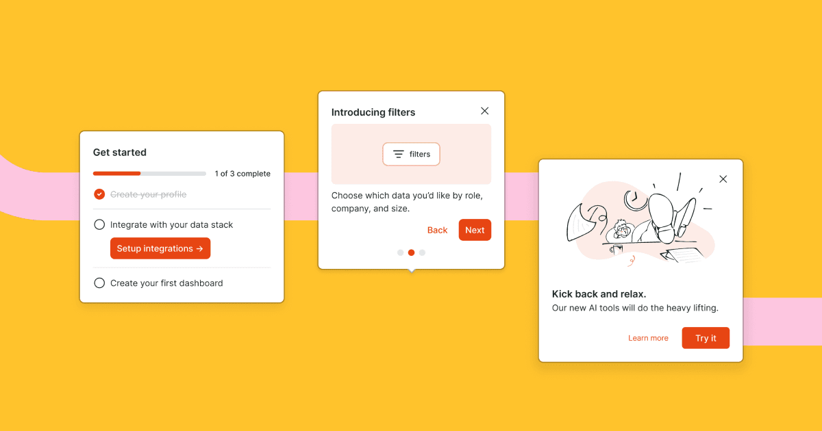
Pre-built, customizable onboarding and education components
We're excited to introduce pre-built, configurable React components that help you start building onboarding and education experiences quickly and come with best practices built in.
Today we're launching checklist, tour, and modal components.
- The checklist component is a great way to get your users up and running in your product with an action oriented set of tasks.
- The tour component is a great way to guide your user through new, undiscovered, or updated product features. Positioning and progression logic is built in.
- The modal component is great for focusing a user's attention on important information in a dialog interface separate from the rest of the content on the page.
The components are represented as new blocks in the flow canvas. The blocks give you the ability to define content like copy, images, videos, and configuration, like whether or not a checklist must be completed in order.
In code, you import the component and access the content and state of the block with a hook.
Here's an example modal:
import Modal, { useModal } from '@dopt/react-modal';
function MyModal() {  const modal = useModal('my-flow.four-pandas-jam');
  return (    <Modal.Root active={modal.active}>      <Modal.Overlay />      <Modal.Content>        <Modal.Header>          <Modal.Title>{modal.title}</Modal.Title>          <Modal.DismissIcon onClick={modal.dismiss} />        </Modal.Header>        <Modal.Body>{modal.body}</Modal.Body>        <Modal.Footer>          <Modal.DismissButton onClick={modal.dismiss}>            {modal.dismissLabel}          </Modal.DismissButton>          <Modal.CompleteButton onClick={modal.complete}>            {modal.completeLabel}          </Modal.CompleteButton>        </Modal.Footer>      </Modal.Content>    </Modal.Root>  );}
Our components are fully composable and give you easy access to all children for customization, such as adding your own event handlers, composing with your own components, or removing children you don't need.
Styling and theming Dopt components is flexible and easy. Dopt components ship with default theme tokens that can be fully customized or extended. You also can style with vanilla CSS, custom themes, and remove default styles.
You can use the components out of the box as a pre-built component or break out and use it headlessly with your own UI component.
We'll be releasing more components in the near future, like cards and banners.
We hope our new components help you get started quickly while still giving you the flexibility to build best of breed product onboarding and education!
You can read more about components at our website and our docs.
