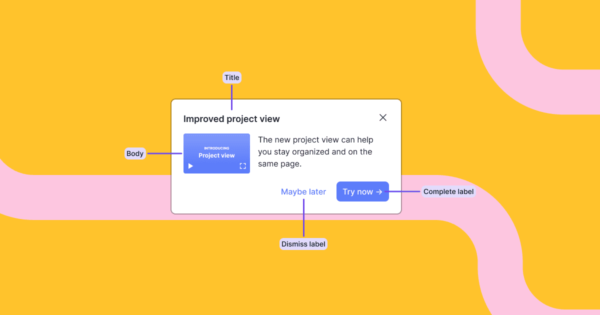
Changelog

Thumbnail image for changelog item

Card component

We launched a new pre-built card component.

Cards are simple but effective. And they’re super flexible. They can be used as contextual tips to teach concepts so users know how to use and get value from your product. They can also be used as an entry point to the next step, like giving them an opportunity to opt-in to a product tour. Or they can bring external content like docs and support into the product at the right time and place, powering a PLG motion.

Here’s an example usage of the card component. In code, you import the component and access the content and state of the block with a hook.

import Card, { useCard } from '@dopt/react-card';
function MyCard() {  const card = useCard('my-flow.four-pandas-jam');
  return (    <Card.Root active={card.active}>      <Card.Content>        <Card.Header>          <Card.Title>{card.title}</Card.Title>          <Card.DismissIcon onClick={card.dismiss} />        </Card.Header>        <Card.Body>{card.body}</Card.Body>        <Card.Footer>          <Card.DismissButton onClick={card.dismiss}>            {card.dismissLabel}          </Card.DismissButton>          <Card.CompleteButton onClick={card.complete}>            {card.completeLabel}          </Card.CompleteButton>        </Card.Footer>      </Card.Content>    </Card.Root>  );}

Our components are fully composable and give you easy access to all children for customization, such as adding your own event handlers, composing with your own components, or removing children you don’t need.

You can use the components out of the box as a pre-built component or break out and use it headlessly with your own UI component.

Read card component docs →

See the card example and custom card example built with Dopt →


Thumbnail image for changelog item

Start flows via SDKs and APIs

You can now programmatically start flows via SDKs and APIs. We’ve exposed our flow start intent in our SDKs and APIs and you can now pass an optional force=true parameter which will forcefully start a flow for a given user despite any targeting conditions. This enables you to build experiences like starting a product tour when a user clicks a button or starting a flow by listening to events in your product (including on the backend). We’ve also updated our reset intent to accept the same parameter, allowing you to forcefully enter a user when they are reset as well. Read docs →

As a part of this work improved the usability of our targeting settings. We made the targeting options more explicit, so you now select if you’d like to target all users, target with an expression, or start via API / SDK only. We also show the setting on the start block. Read docs →

Updated JS and Node blocks API client libraries

We released two new client libraries for our blocks API.

These client libraries are thin language-specific abstractions on top of our Blocks API, allowing you to access and update blocks and flows easily. We've shifted to a different technology for generating the clients and updated the spec in the process, resulting in a few nice updates.

  • Method names are more semantic and align with methods exposed in our @dopt/react and @dopt/javascript SDKs.
  • Better error types and error handling
  • More readable generated source!

The previously released Blocks API client library @dopt/blocks-javascript-client is now deprecated.

Blocks API docs →

React component updates

We’ve migrated our React components to use vanilla-extract, a zero-runtime styling library. This resulted in smaller bundle sizes as well as improved performance as styles are no longer compiled at runtime.

This is a breaking change, so please have a look at our migration steps for more info. In short, the createTheme API has changed a bit and now requires strict adherence to the theme interface and we’ve changed the way styles are bundled so your bundler will need to be aware of how to handle CSS imports. The CSS variable interface remains the same.

We’ve also created separate exports for our component hooks for cases where you’d like to use our components in a headless fashion. These exports can be accessed from any component via @dopt/react-*/hooks. In the case of the modal component, you would import useModal from @dopt/react-modal/hooks. Using the hooks-only export will not include any of the component or theme CSS.

Duplicate flow and block

We’ve added the ability to duplicate flows and blocks! These features make it easy to reuse existing flows and blocks for new use cases. You could also use a flow as a lightweight template.

Other improvements

  • Added the ability to copy flow ID from the flow listing page
  • Improved the usability of drag and drop of fields in the flow view
  • Made block names more readable on the flow canvas

Thumbnail image for changelog item

Easily include rich text, images, and videos with rich text fields

We’re excited to bring you a new field type: rich text. Rich text fields allow you to define content like text, headings, lists, formatting, images, links, embeds, and more! Now you can easily add your on-brand images, looms, and Calendly links to your Dopt-powered experiences. We’ve built a WYSIWYG editor on top of this field type to make it easier for you to create the perfect piece of content.

We’ve created @dopt/react-rich-text to make it easy to consume rich text content in your app. Additionally, all of our components also utilize rich text for certain pieces of content. For example, you can use rich text when defining the modal’s body content.

Read rich text docs →

New sign-up options, workspaces, and user management

You can now sign up to Dopt with any email provider. We also added the ability for users to join multiple Dopt workspaces, invite users to a workspace, and disable and enable users in a workspace.


Thumbnail image for changelog item

Pre-built, customizable onboarding and education components

We're excited to introduce pre-built, configurable React components that help you start building onboarding and education experiences quickly and come with best practices built in.

Today we're launching checklist, tour, and modal components.

  • The checklist component is a great way to get your users up and running in your product with an action oriented set of tasks.
  • The tour component is a great way to guide your user through new, undiscovered, or updated product features. Positioning and progression logic is built in.
  • The modal component is great for focusing a user's attention on important information in a dialog interface separate from the rest of the content on the page.

The components are represented as new blocks in the flow canvas. The blocks give you the ability to define content like copy, images, videos, and configuration, like whether or not a checklist must be completed in order.

In code, you import the component and access the content and state of the block with a hook.

Here's an example modal:

import Modal, { useModal } from '@dopt/react-modal';
function MyModal() {  const modal = useModal('my-flow.four-pandas-jam');
  return (    <Modal.Root active={modal.active}>      <Modal.Overlay />      <Modal.Content>        <Modal.Header>          <Modal.Title>{modal.title}</Modal.Title>          <Modal.DismissIcon onClick={modal.dismiss} />        </Modal.Header>        <Modal.Body>{modal.body}</Modal.Body>        <Modal.Footer>          <Modal.DismissButton onClick={modal.dismiss}>            {modal.dismissLabel}          </Modal.DismissButton>          <Modal.CompleteButton onClick={modal.complete}>            {modal.completeLabel}          </Modal.CompleteButton>        </Modal.Footer>      </Modal.Content>    </Modal.Root>  );}

Our components are fully composable and give you easy access to all children for customization, such as adding your own event handlers, composing with your own components, or removing children you don't need.

Styling and theming Dopt components is flexible and easy. Dopt components ship with default theme tokens that can be fully customized or extended. You also can style with vanilla CSS, custom themes, and remove default styles.

You can use the components out of the box as a pre-built component or break out and use it headlessly with your own UI component.

We'll be releasing more components in the near future, like cards and banners.

We hope our new components help you get started quickly while still giving you the flexibility to build best of breed product onboarding and education!

You can read more about components at our website and our docs.