Card component
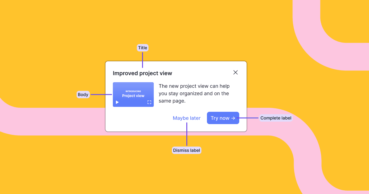
We launched a new pre-built card component.
Cards are simple but effective. And they’re super flexible. They can be used as contextual tips to teach concepts so users know how to use and get value from your product. They can also be used as an entry point to the next step, like giving them an opportunity to opt-in to a product tour. Or they can bring external content like docs and support into the product at the right time and place, powering a PLG motion.
Here’s an example usage of the card component. In code, you import the component and access the content and state of the block with a hook.
import Card, { useCard } from '@dopt/react-card';
function MyCard() {  const card = useCard('my-flow.four-pandas-jam');
  return (    <Card.Root active={card.active}>      <Card.Content>        <Card.Header>          <Card.Title>{card.title}</Card.Title>          <Card.DismissIcon onClick={card.dismiss} />        </Card.Header>        <Card.Body>{card.body}</Card.Body>        <Card.Footer>          <Card.DismissButton onClick={card.dismiss}>            {card.dismissLabel}          </Card.DismissButton>          <Card.CompleteButton onClick={card.complete}>            {card.completeLabel}          </Card.CompleteButton>        </Card.Footer>      </Card.Content>    </Card.Root>  );}
Our components are fully composable and give you easy access to all children for customization, such as adding your own event handlers, composing with your own components, or removing children you don’t need.
You can use the components out of the box as a pre-built component or break out and use it headlessly with your own UI component.
See the card example and custom card example built with Dopt →