SDK and API performance improvements

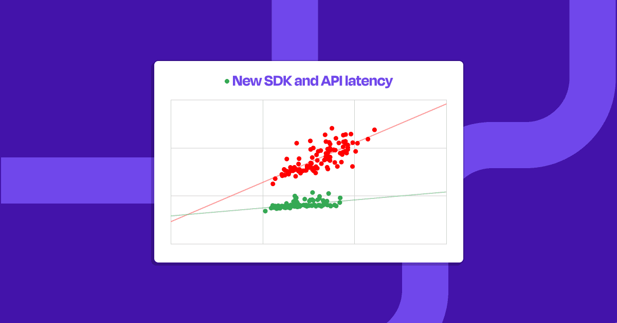
In the last few weeks, we’ve reduced peak p95 and p99 latencies for our blocks and users SDKs and APIs by over 56% through better caching, database indexing, and horizontally scaling our services.
We’ve also shipped performance improvements for our analytics and user flow monitoring workflows.
Dopt React 4.0 SDK
Now, with even more of the things you love! Our SDKs have always supported cross-tab, cross-device usage, and we’ve always relied on websockets and pub-sub to push changes to client state and user properties to our SDKs as quickly as possible.
With @dopt/react 4.0, we’ve made our react SDK more resilient and performant by:
- improved session reconnectivity — when your connection to Dopt goes down, we’ll wait for it to come back and pick up where you left off
- fewer API calls — we’ve moved our flow
/startrequests into our API so that the SDK doesn’t have to manage starting flows - better hook caching — we’ve reduced the number of updates our hooks trigger by simplifying our dependencies and leaning on refs.
We love all our SDKs, and we’ve folded these changes into @dopt/javascript and @dopt/vue as well — we didn’t publish major changes there since those packages were already previously rewritten deeply when we first built out support for Vue.
SDK changelogs:
Other improvements
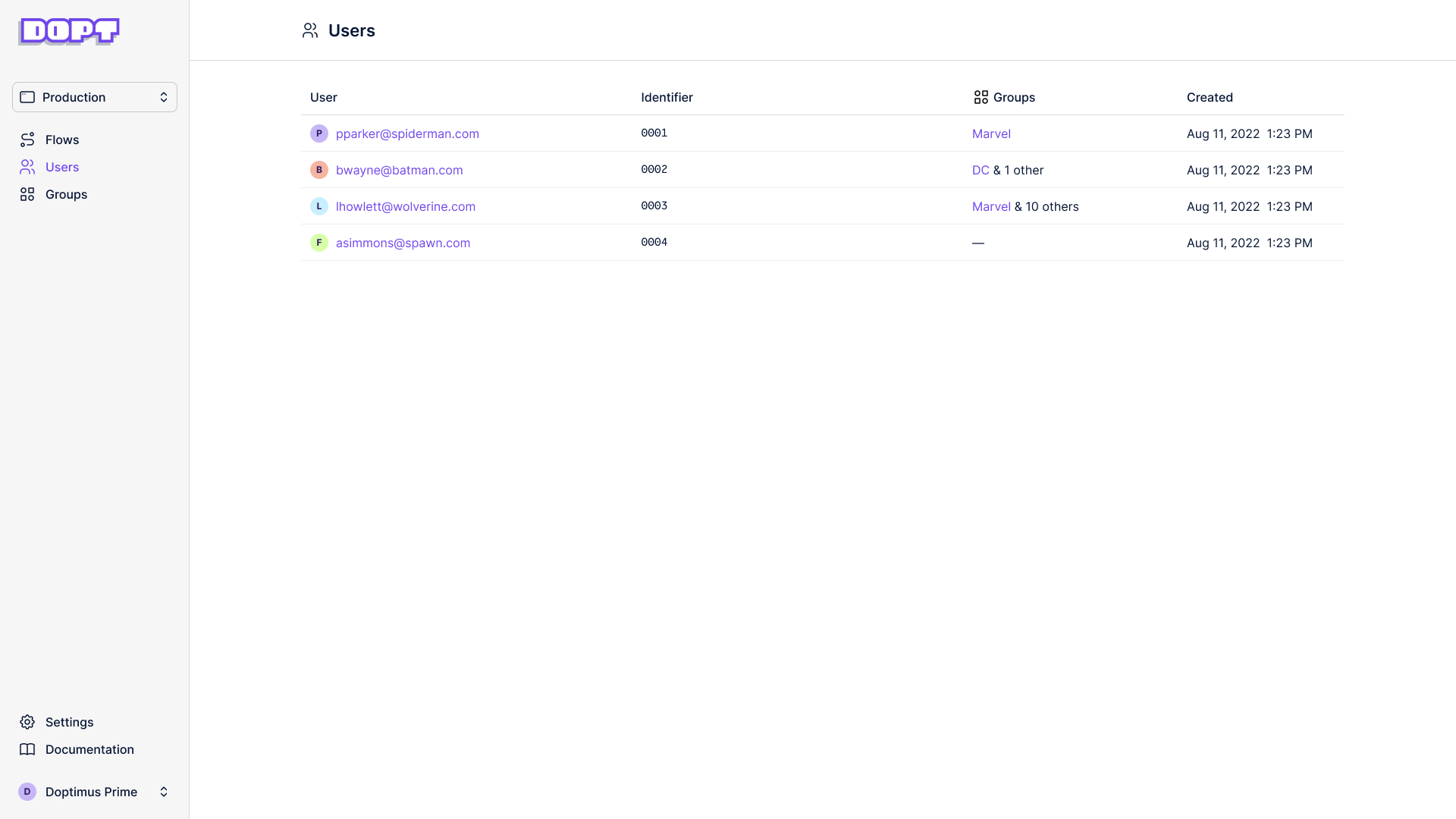
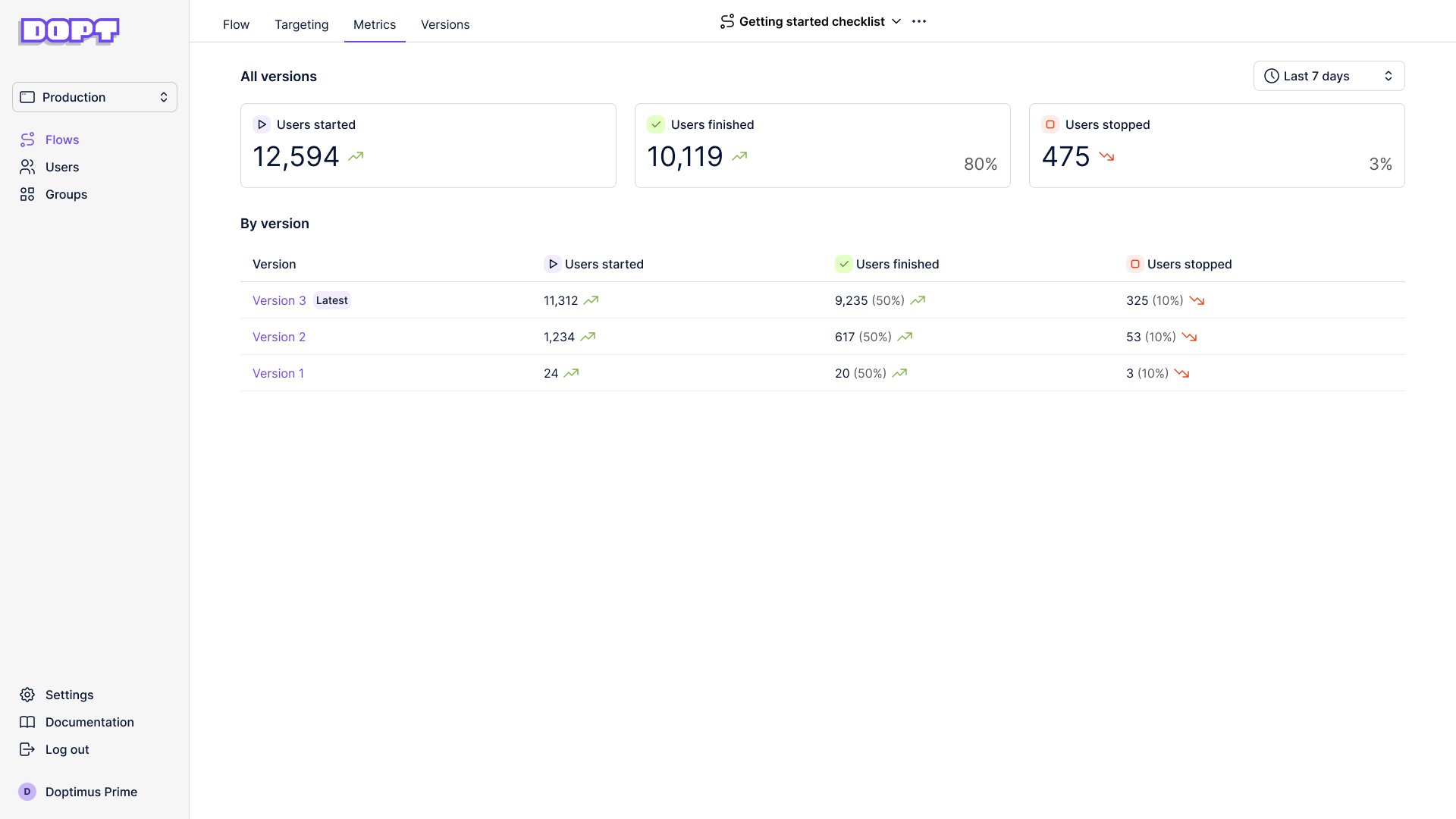
- We added search on the users page. You can search over user identifier and email (if you identified it to us).
- Text areas for string fields now wrap.
- Paths are easier to connect because we made the drop zone larger and eliminated a dead spot zone.
- Tab selection on the flow view panel is now sticky, so if you select “Fields” on a block, if you navigate to a new block you’ll stay on the “Fields” tab.
- It’s easier to pan on the flow view while holding the
spacebar. - When you switch workspaces, you’ll now land on the flows page rather than a URL.