Embedded tips

Example

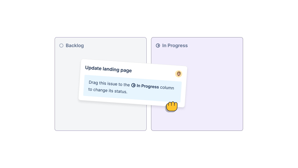
This example shows how to use Dopt to build contextual, embedded tips to onboard users. Each page has a simple tip that helps users learn about important product and UI concepts.

When to use

Contextual tips are simple, but effective. And they’re super flexible. They can be used:

  • Across the entire user journey for onboarding, education, announcements, or empty states
  • To contextually teach key concepts so users know how to use and get value from your product
  • As an entry point to an important next step, facilitating relevant onboarding and education flows
  • To bring external content like docs and support into the product at the right time and right place, powering a PLG motion

Why it works

  • They progressively and contextually disclose content while using the app.
  • Feel like a natural part of the UI, so they’re not overly distracting or spammy.
  • They’re simple. Often gives the option to learn more if they want.
  • Since they’re simple, they’re easy to get started with.

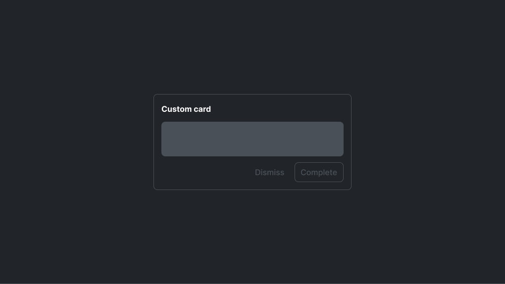
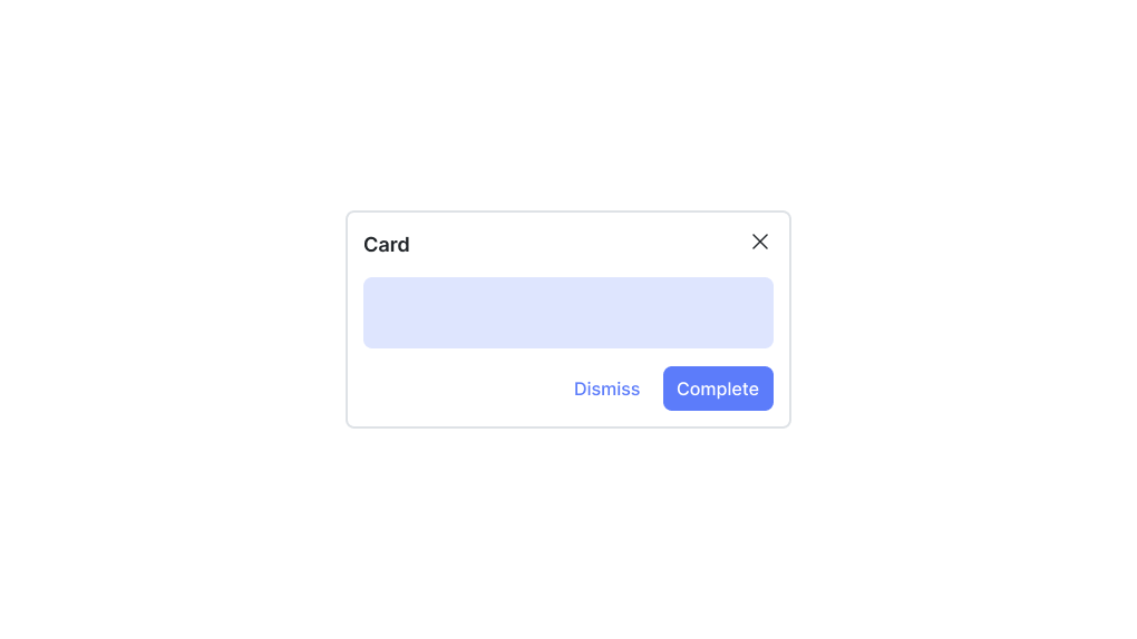
The embedded tips could be a simple bit of text, a banner, a card with video and links, or a carousel with many images. They can be used individually, or since they’re embedded, they can be combined with checklists and as a part of a multi-step flow.

How to make embedded tips using Dopt

This is the Dopt flow that powers the embedded tips.

Dopt flow

Here’s an example of how to build the embedded tip on the Library page.

Embedded tip UI

With Dopt’s SDKs, you use hooks to access block state and transition users through flows. Dopt automatically persists user flow state (which user has done what).

To build this tip, Dopt’s SDKs give you access to the Library tip block’s state. You use that state to set the visibility of the <Tip />. When the user clicks the “Okay, got it!” button, transition('default') is called on the Library tip, which sets the block to active: false so the card is no longer shown.

src/pages/index.tsx
import { Flex } from '@chakra-ui/react';import { Layout, Tip } from '@/components';import { useBlock } from '@dopt/react';
export function Index() {  const [{ state }, transition] = useBlock('75yCV9cpoWSTKJ_oyaDP9');  return (    <Layout title="Library">      <Flex direction="column" gap={4} width="100%">        {state.active && (          <Tip            thumbnailSrc="tip-thumb-1.png"            title="Keep everyone in sync"            description={`              The Library is your internal recorded meeting hub.               Upload videos to this shared space for automatic               transcriptions and powerful collaboration features!            `}            onComplete={() => transition('default')}          />        )}        ...      </Flex>    </Layout>  );}

Real world examples of embedded tips

Dovetail’s embedded tips offer helpful videos and content about key concepts to onboard users. They're contextual and discovered while using the product. They never feel in the way.

Coda uses embedded tips as an entry point to the next best step for the user. This is about facilitating the best flow (rather than teaching, like Dovetail).

15Five uses embedded tips to help users understand key concepts, similar to Dovetail. They also offer links to relevant best practices and support. A great example of bringing external assets into the right place at the right time in-product.

Dovetail video, Coda image, and 15Five image provided by Page Flows.