A component library to build
product onboarding, fast
product onboarding, fast
Ship onboarding and education in minutes with Dopt’s React library. Our prebuilt
components have best practices built-in and are fully customizable and composable.
Checklist
Help users understand how to use your product or feature with an action oriented set of tasks. Use our SDKs to complete tasks from the frontend or backend. Dopt manages the states for you.
Read docs →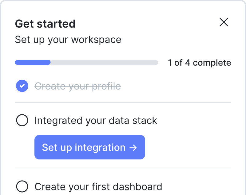
Tour
Guide users through new, undiscovered, or updated features. Positioning and progression logic built in.
Read docs →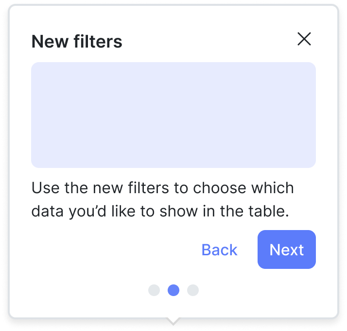
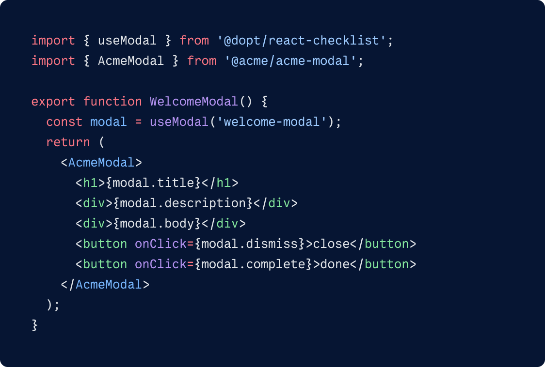
Modal
Welcome new users to your app, announce updates, or give users timely warnings and alerts with a focused pop-up dialog.
Read docs →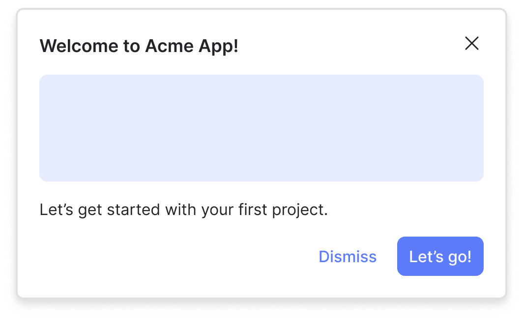
Card
A simple embedded element that can be used to contextually highlight new features, important updates, or to provide helpful tips.
Read docs →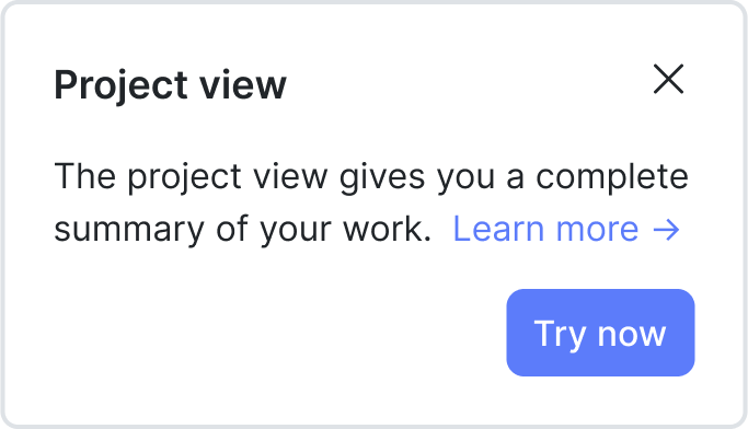
Hints
Provide users with on-demand and contextual guidance and tips accessed through a pulsing dot. Positioning logic built in.
Read docs →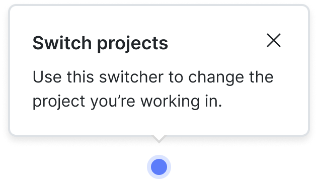
Banner
Convey time sensitive information, share an update, or prompt users to act with a message at the top of your app.

Badge
Contextually call attention to new or important feature with a simple badge.
Easily style and theme
Use CSS or our theme layer to fully customize the look and feel of pre-built components.
Don’t reinvent the wheel
Our library has design and development best practices baked in to give you a head start on building great experiences.
Composable
Get granular access to all parts of the component — enabling you to compose UI the way you want.
Want to use a custom React component? Don’t use React?
Go headless.
“Bring your own UI” SDKs give you maximum flexibility to build flows to your exact needs.